From Fragmented to Flagship.
-
Interactive on-demand courses led by world-class executive coaches, coaches from the 100 Coaches community, and thought leaders spanning leadership, communication, strategy, and culture.
-
Five separate brand environments — each functioning like an isolated silo. No shared color logic, no type system, no logo rules. Every touchpoint looked like a different company.
-
A complete visual identity system built to scale across all five layers: one mark, one palette, one type hierarchy, and layer-specific rules that unify without flattening.
Client:
Methods · Harmony Public Schools
Scope:
Full Brand Redesign
Deliverables:
Logo, Color System, Typography, UI, Guidelines
Year:
2026
A premium platform
without a premium brand.
Methods is an interactive leadership learning platform backed by Marshall Goldsmith and the 100 Coaches, one of the most influential networks of executive coaches and business thinkers in the world. The content was elite. The brand was not.
Across five distinct digital layers (marketing, social, website, LMS, and course content) the brand had no cohesion, no system, and no visual identity that matched the caliber of who they were. My job was to fix all of it.
Five Layers Working Against Each Other
Methods operated across five distinct environments and each one was making up the brand as it went. The result was visual fragmentation that undermined trust and diluted the credibility of the platform's world-class instructors.
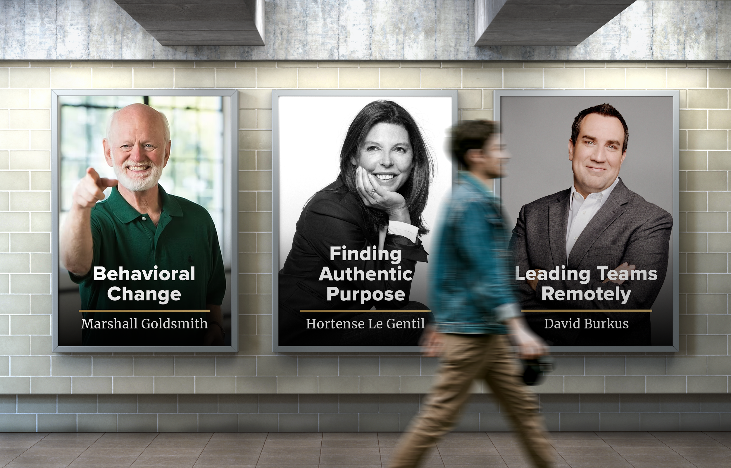
No defined visual language for print or advertising materials. Instructor headshots, copy, and layout decisions were made asset-by-asset with no repeatable system. The brand couldn't scale.
Marketing & Print
1
Profile images, post formats, and in-feed content had no shared color, type, or compositional logic. Followers saw a different brand every week — no brand recognition was building.
Social Media
2
The public-facing site used gold inconsistently, mixed multiple type treatments, and lacked a clear hierarchy. The premium positioning of the content was invisible in the UI.
Website
3
The back-end learning system had its own visual logic entirely — no connection to the main brand. Students crossing from the website into the platform felt like they'd entered a different product.
Lightspeed LMS
4
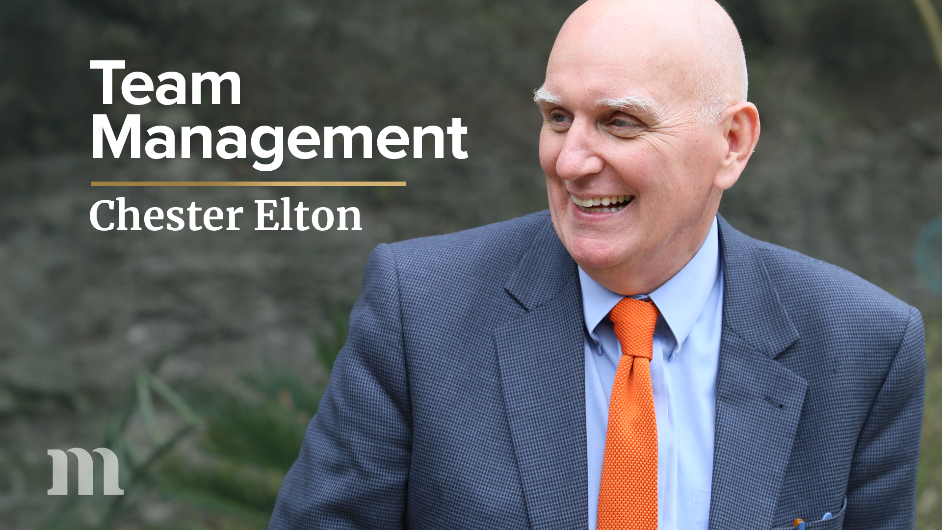
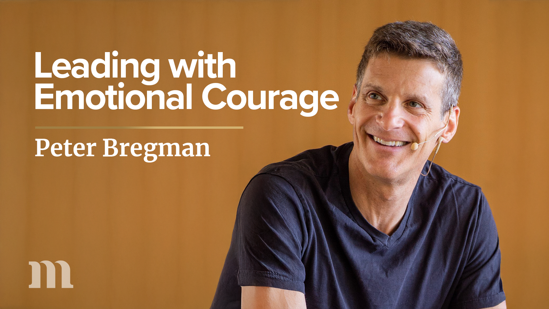
Each course was treated as an island. Instructor branding, title cards, and in-video graphics had no shared system. Twenty courses looked like they came from twenty different studios.
Course Content
5
The Mark
A logo system built to flex without breaking. Four configurations: Lettermark, Wordmark, Lockup, and the Wordmark Alternative, each built from the same proportions but suited to a different job. The Lettermark holds up at the size of a favicon or social profile photo, where the full logo would lose all detail. The Wordmark works in tight horizontal spaces like a nav bar. The Lockup is the default for most marketing and print. The Wordmark Alternative exists specifically for moments that need to surface the Marshall Goldsmith and 100 Coaches partnership, giving Methods a way to lean on that credibility without redesigning the lockup every time it comes up.
The Gradient
The gold gradient runs at a fixed 45-degree angle, light gold at the top right, fading to dark gold at the bottom left. Every gradient asset across the brand follows this same direction and color flow, so whether it's the logo, a button, or a divider, the gold always feels like it's coming from the same light source.
One Palette Across Five Environments
The color system had to do two jobs: build a premium public-facing identity, give each course its own visual world, and everything in between. The primary palette is anchored in gold, black, and white with an alternate green. The secondary palette of 27 course colors is primarily built for the course layer but can surface publicly in small ways, like course card accents, to hint at the variety inside the platform.
Primary Colors
Secondary Colors
Each of the 9 hue families has 3 tonal stops, giving every course enough range to build its own voice without drifting from the system. Enough variety to feel distinct, enough structure to feel like it all belongs together.
Gold was designed to work across every background. Dark gold on light, light gold on dark, gradient gold on either. Three versions were built to maintain contrast across any context or application.
The mark needed to hold up beyond just the gold gradient. White and black versions exist for backgrounds where the gradient won't read clearly, same proportions, just built to stay legible no matter the surface.
The details that make a system feel intentional.
Two structural elements anchor the visual language across every touchpoint: the Golden Bar and the Overlay Gradient. Small decisions that compound into a recognizable aesthetic.
The Golden Bar
A horizontal gradient bar running dark gold (#A07F44) to light gold (#D3B271), left to right. Used to separate content sections, underscore key messaging, and signal hierarchy. Appears in marketing, course cards, and print.
The Overlay Gradient
A bottom-up dark gradient is applied over content to create a legible surface for text without masking the subject. Used on instructor headshots, hero images, and course thumbnails.