From Fragmented to Flagship.
Client:
Methods · methodsof.com
Scope:
Full Brand Redesign
-
Interactive on-demand courses led by world-class executive coaches, coaches from the 100 Coaches community, and thought leaders spanning leadership, communication, strategy, and culture.
-
Five separate brand environments — each functioning like an isolated silo. No shared color logic, no type system, no logo rules. Every touchpoint looked like a different company.
-
A complete visual identity system built to scale across all five layers: one mark, one palette, one type hierarchy, and layer-specific rules that unify without flattening.
Deliverables:
Logo, Color System, Typography, UI, Guidelines
Year:
2026
A premium platform
without a premium brand.
Methods is an interactive leadership learning platform backed by Marshall Goldsmith and the 100 Coaches, one of the most influential networks of executive coaches and business thinkers in the world. The content was elite. The brand was not.
Across five distinct digital layers (marketing, social, website, LMS, and course content) the brand had no cohesion, no system, and no visual identity that matched the caliber of who they were. My job was to fix all of it.

Five layers. Zero system.
Methods operated across five distinct environments and each one was making up the brand as it went. The result was visual fragmentation that undermined trust and diluted the credibility of the platform's world-class instructors.
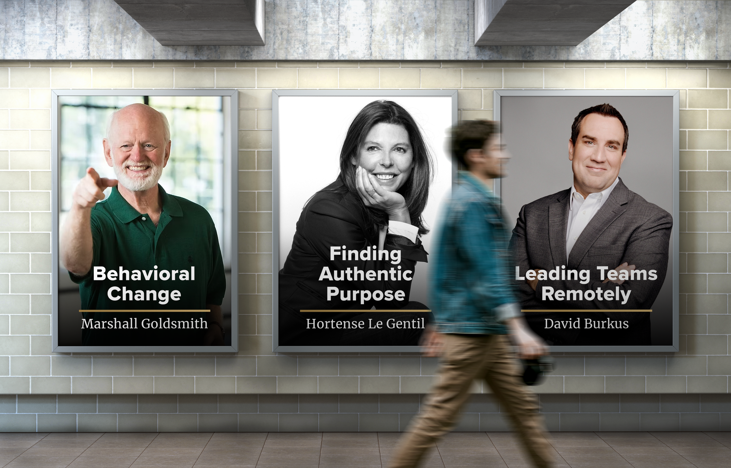
Marketing & Print
1
No defined visual language for print or advertising materials. Instructor headshots, copy, and layout decisions were made asset-by-asset with no repeatable system. The brand couldn't scale.
Social Media
2
Profile images, post formats, and in-feed content had no shared color, type, or compositional logic. Followers saw a different brand every week — no brand recognition was building.
Website
3
The public-facing site used gold inconsistently, mixed multiple type treatments, and lacked a clear hierarchy. The premium positioning of the content was invisible in the UI.
Lightspeed LMS
4
The back-end learning system had its own visual logic entirely — no connection to the main brand. Students crossing from the website into the platform felt like they'd entered a different product.
Each course was treated as an island. Instructor branding, title cards, and in-video graphics had no shared system. Twenty courses looked like they came from twenty different studios.
Course Content
5
The Result
A platform that felt smaller than it was.
World-class instructors. Elite knowledge. But a brand that communicated none of it. Because there was no brand to communicate.
Old
New